Grey, green, cream, blue or white? An expert reveals the tricks for choosing the right color for your living room walls
Cozy and relaxing – that’s what we want from our living room. Wall paint can make a big contribution. The comfiest sofa and plush carpet don’t help much if the white walls look like icebergs. But what color should you paint your living room? Interior designers know which colors look cozy and comfortable and which colors you should avoid. We also use examples to show how wall colors can work well. And remember, you can learn more details about a project and professional work.
Find the right living room color. You have to like the color, we summarize it and explain the search for wall colors for the living room as a joint project for the whole family. The living room is a communal area, therefore you have to make sure that everyone likes the color or at least does not like it. Otherwise, this will cause discord in the family.
Customers usually have an initial, vague idea of the colors in question. For the expert, this is the starting point for his advice. “I took it very seriously and then worked on the idea. “The color should suit the living room, the customer, and create the atmosphere that the customer wants,” says the expert explaining the challenge of finding the right living room wall color. “Ask yourself, what kind of atmosphere do I want?” said the expert.
“I ask my customers to explain to me in two to three sentences what atmosphere they want for their living room,” says the expert, who, as he himself says, “speaks the language of color” based on many years of experience. And this is exactly how he tells his customers to predict the effect the chosen color will have on your living room.
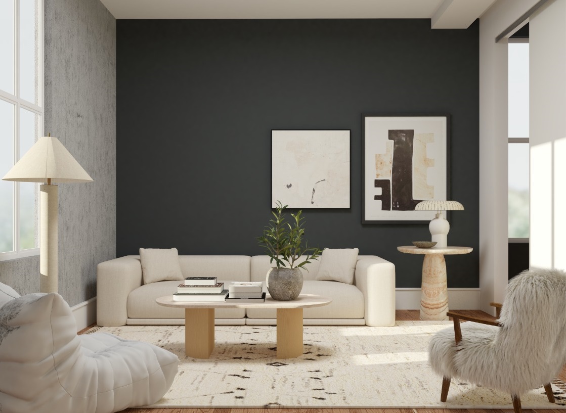
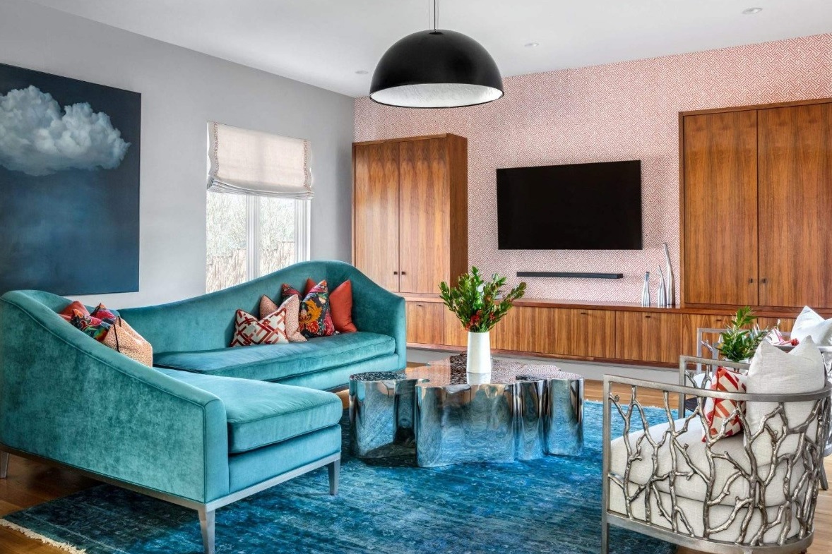
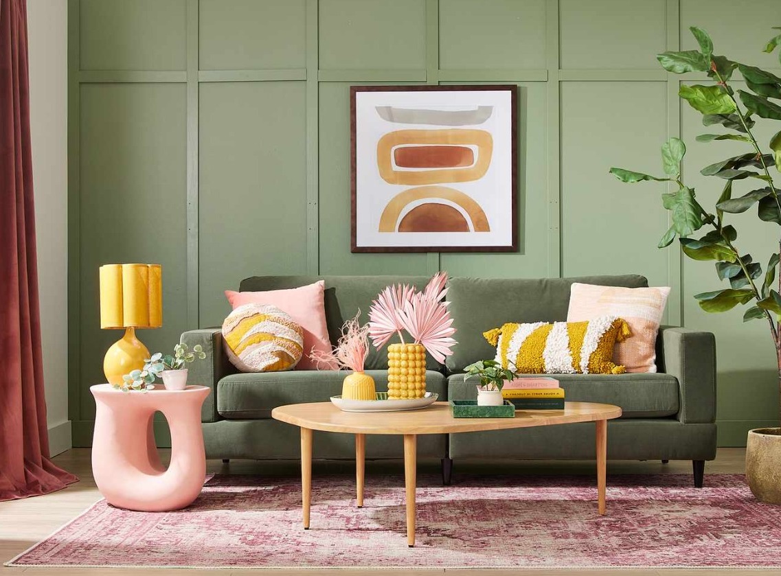
Wall colors for a calm and relaxing atmosphere. Color experts don’t think too much about white walls in the living room: “The living room should offer a contrast to everyday life. Hard, white walls are not always the best choice. You can create an atmosphere with color designs. Choose cheerful and warm colors. Powder tones, slate gray, or even light olive green are great wall colors for the living room.”
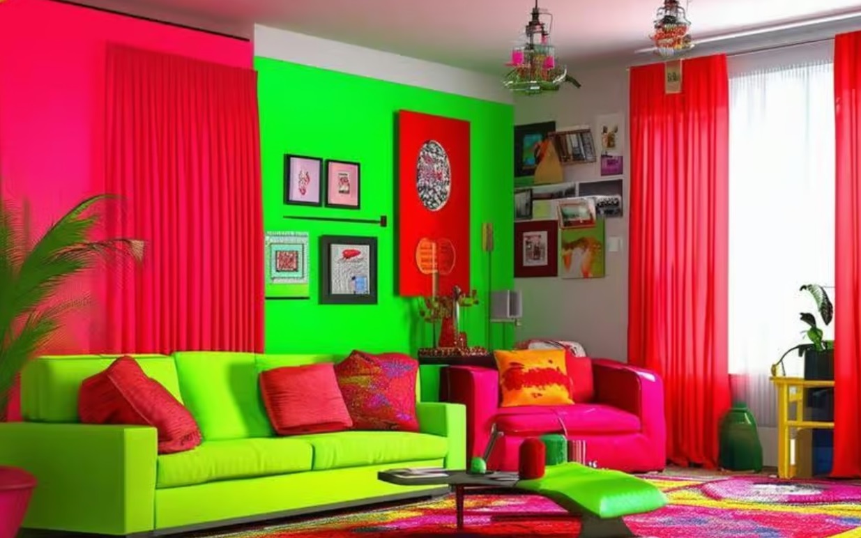
Paint the living room walls a bright color? Interior designers also advise against this, at least when it comes to wall design. You should only use strong tones selectively. And of course it must match the furniture. A sofa cushion in a strong color is better than an entire wall in a bright color.
Coordinate the wall color with the furniture. Sofa, carpet, sideboard – whether you have found the right color for your living room depends not only on the members of your family but also on the furnishings in the room. “Color always lives from its relationship with other colors.”
A living room full of antique wooden furniture and old wooden floorboards benefits from cool gray living room walls, while the same gray walls look unwelcoming and cold when combined with white furniture. Should the existing furniture in the living room be rearranged to match the new wall color or should the entire room including the furniture be redone?
This only becomes a problem when the living room walls have already been painted a color and now you want to change it. Because the old wall color also influences the effect of the new color pattern. “Take a piece of white cloth and hang it in a large area in front of the colored living room wall. This way you can better assess the effect of the new living room colors.”
Is your living room furnishings more colorful or are the pictures hanging there strong in color? The more colorful the combination, the more important it is to use strong colors on the walls. This makes things seem calmer and more harmonious overall.
Sample the living room first. To find out which wall color is suitable for your living room, you cannot avoid sampling on a large scale.
“A4 DIN sheets are not enough,”, who worked with a 60 by 80 centimeter box with the desired color in his color consultation. You should sample at least half a square meter of color to get a rough idea of how the color will look in the room. “Hang samples on the wall and look at them at different times of the day and in different lighting situations before you let the painter come. This approach reduces the risk of wall design failure and is much cheaper than painting the room a second time.
Additional tip for those in a hurry: To get a first impression of the effect of color on the room, you can also use a large towel or sweater in your favorite color, it is not always enough.
What wall color do you use to paint your living room?
The Meaning and Psychological Effects of Wall Paint Colors in the Home
In the realm of interior design, color serves an aesthetic purpose and carries significant meaning. Studies have shown that color can impact the emotions of individuals who perceive it. This influence of color on mood is known as color psychology.
Color is a spectrum within light, with each color possessing a unique wavelength that sets it apart from others. It is these light waves that have an impact on human psychology.
In interior design, the selection of colors is crucial in shaping the overall look and feel of a room. Errors in color choices can lead to discomfort for the inhabitants of a home.
What Does Color Theory Mean in Interior Design?
When considering color in interior design, it’s not just about how the hues complement each other visually. It’s equally important to consider the emotional responses that the colors used in a room can evoke.
Color psychology in interior design is a concept that focuses on using color to create specific moods and atmospheres. Colors are carefully chosen to elicit emotional reactions and establish particular moods. Research into color theory has linked specific emotions to individual colors, taking into account factors such as hue, saturation, and tint.
The study of color psychology has been ongoing for centuries. Color is a reflection of how our brains and vision perceive different light wavelengths, from shorter wavelengths (blue or violet) to longer ones (red). This spectrum constitutes what is commonly known as the color wheel. The scientific exploration of color began with the experiments of Isaac Newton in the 17th century, who developed the first color wheel, and continued with Johann Wolfgang von Goethe, who published his influential “Theory of Colors” in 1810. His work was the first to delve deeply into the psychological impact of color on human emotions.
Color theory extends beyond interior design to fields such as fine arts, advertising and branding, fashion, beauty, industrial design, and more. It even influences broader cultural trends—consider the shift from the somber olive, gray, and neutral tones of World War II to the vibrant pastels of the prosperous 1950s, and then to the bright neon colors of the psychedelic ’60s. In these cases, popular color choices were influenced by the national mood. Understanding the meaning of color in interior design is vital because we spend a significant amount of time in our homes, and the atmosphere we create there greatly affects our daily moods and lifestyles. It also influences the impression our homes leave on visitors, whether it’s welcoming, cold, or chaotic. What does your home convey about you? Color plays a significant role.
The Role of Color in Home Interiors
Firstly, color adds aesthetic value and beauty to the interior of a home. Certain colors can enhance the visual appeal of an interior design concept compared to others.
Secondly, color can manipulate the appearance of a room to achieve a desired look. For instance, if a room needs to appear larger and brighter, bright colors like white and cream are typically used.
Lastly, color can have a positive and calming effect on the interior of a home. This function of color is closely tied to its psychological impact, as each color choice can influence the emotions and state of mind of the home’s occupants.
The paint color on the walls of a house significantly impacts the atmosphere and ambience of a room. Each color conveys distinct meanings and psychological effects, and selecting the right color can enhance the comfort and visual appeal of the house. Here’s an explanation of the meanings of some commonly used wall paint colors in homes:
- White
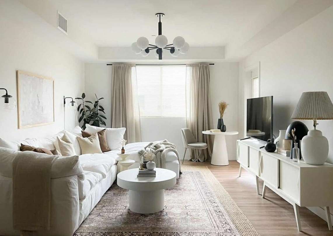
White represents purity, cleanliness, and simplicity. This color is frequently used to create the perception of a spacious and tidy space. White can establish a serene and tranquil atmosphere. It also creates the illusion of a larger and more open room. It’s suitable for use in nearly any room, particularly in the living room, bedroom, and kitchen. White is also a popular choice for ceilings and trim.
- Blue
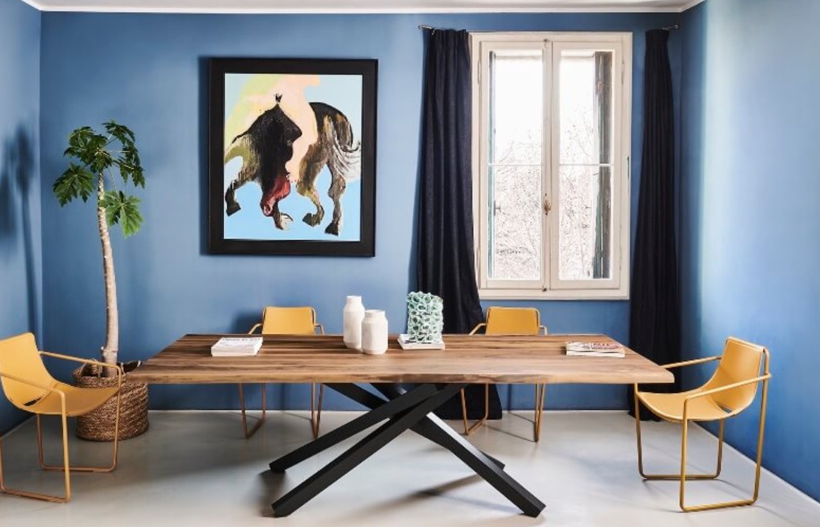
Blue is often associated with calmness, peace, and wisdom. This color can impart a sense of coolness and tranquility. Blue can help alleviate stress and foster a calming atmosphere. It can enhance concentration and productivity. Ideal for bedrooms and workspaces. Light blue is suitable for family rooms or bathrooms, while dark blue can be used for striking accents.
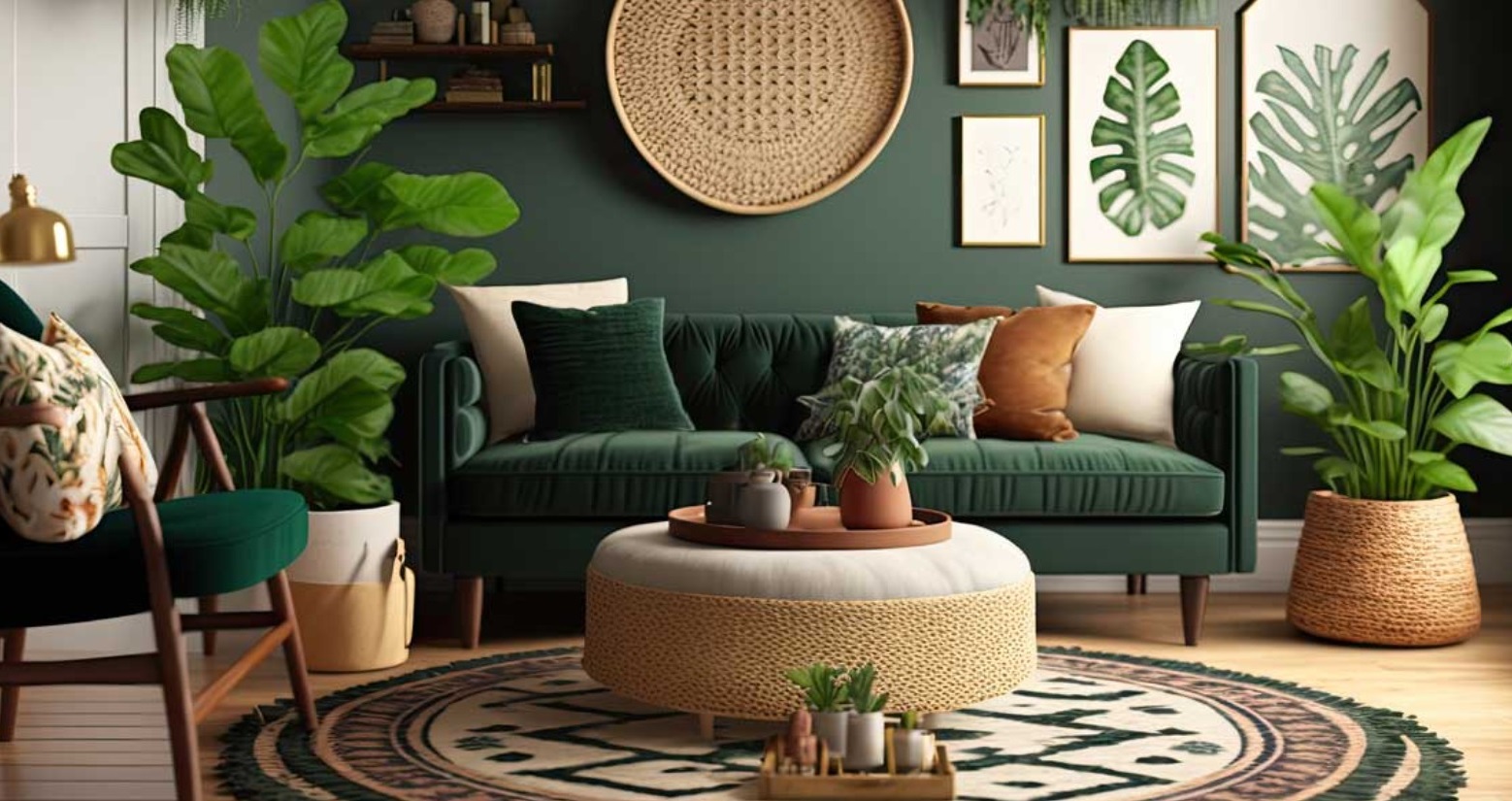
- Green
Green symbolizes nature, freshness, and balance. This color can create a harmonious and invigorating ambiance. Green soothes the eyes and can help alleviate stress. It’s also considered a color that aids in healing and relaxation. It’s great for almost any room, especially bedrooms, living rooms, and dining rooms. Soft greens can create a peaceful atmosphere, while dark greens can add an elegant touch.
- Yellow
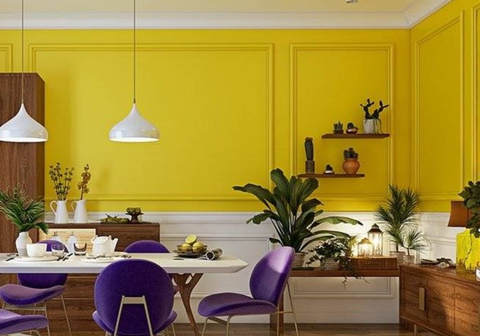
Yellow represents happiness, warmth, and energy. It can be uplifting and cheerful. Yellow can elevate your mood and inspire you. However, excessive use can make a room feel overly bright or agitating. It’s suitable for kitchens, dining rooms, and areas that need an extra boost of energy. Soft yellow can be used in bedrooms or living rooms to create a welcoming atmosphere.
- Red
Red is the color of courage, strength, and passion. It’s a very powerful color and can infuse energy into a room. Red can increase adrenaline and energy, but it can also evoke feelings of anxiety or anger if used excessively. It’s good for dining rooms and living rooms as an accent color. Red can stimulate conversation and increase appetite.
- Purple
Purple symbolizes luxury, creativity, and spirituality. It’s a color often associated with wealth and wisdom. Purple can stimulate the imagination and calm the mind. Dark purple creates a dramatic impression, while light purple fosters a serene atmosphere. Suitable for bedrooms and workspaces. Soft purple can be used in living rooms or bathrooms for a more relaxing feel.
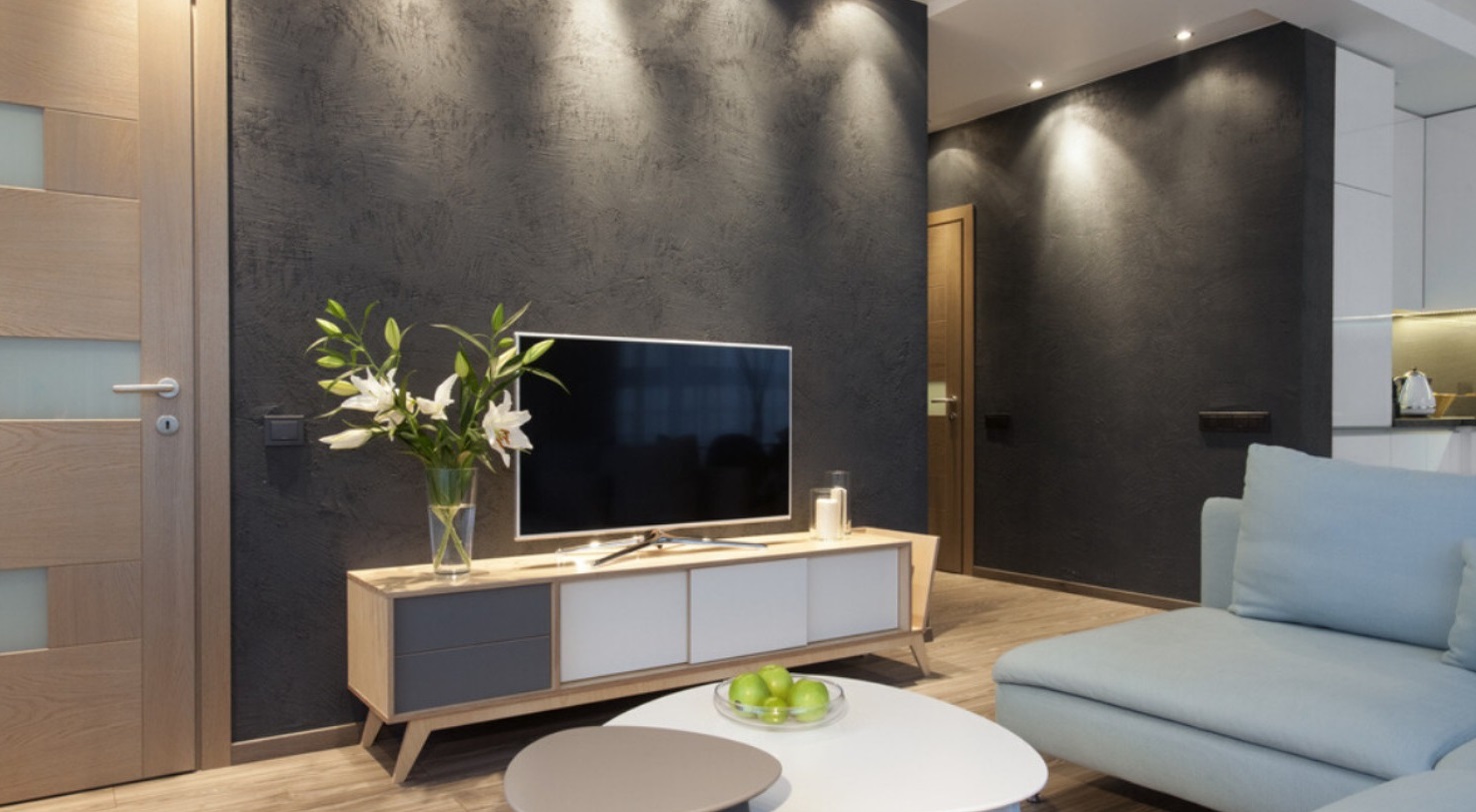
- Gray
Gray symbolizes neutrality and balance. It’s an elegant and versatile color. Gray imparts a sense of calm and stability. However, an excessive amount of gray can make a room feel gloomy. It’s suitable for living rooms, bedrooms, and offices. Light gray can make a room feel brighter and more open, while dark gray adds a touch of luxury.
- Brown
Brown symbolizes stability, warmth, and comfort. It’s a natural and soothing color. Brown can create a sense of security and warmth. This color makes a room feel cozy and inviting. Suitable for living rooms and dining rooms. Dark brown can convey an elegant impression, while light brown is more subdued and approachable.
- Orange
This color is a combination of red and yellow and is suitable for use in family rooms or dining rooms because it has a comforting, friendly effect and stimulates the appetite. However, because it’s quite striking, it’s better not to use too much orange, as it can reduce focus.
The psychology of room color is more intricate than just the symbolism of a color. This is because there are specific properties of color that can also be manipulated to evoke particular moods and emotions. Take the aforementioned shade of yellow, for example. Depending on the specific shade you choose, this hue can make you feel happy or envious. Why do paint samples come in dozens of variations of a single color? Because color has numerous characteristics that can significantly alter the mood it creates. Here are some of the most common color attributes, or hues, to consider when creating an interior design palette.
Color If you take a base color and mix in some white, you’ll end up with a lighter shade. For instance, a luxurious, sensual purple becomes a tranquil, serene lavender when combined with white. Pastel colors generally evoke a vintage or childlike feel and are often used in nurseries or children’s bedrooms; they also complement older, classic architectural styles in homes. They can also create a sense of spaciousness in a room, and when paired with white accents, they produce a timeless look.
On the other hand, when you add black to a color, you create a darker shade. Light greys will take on a more earthy tone when darkened, while a touch of black can transform an aqua blue into a deep sea color. Pairing these colors with neutrals or lighter colors will bring balance and prevent the darker color from dominating the room.
Tone This falls somewhere between a shade and a hue, as gray is added to a hue to create a tone. This is especially useful when toning down the intensity of a very bright color like purple or orange to create a softer hue.
Value This refers to how much light a color contains. In essence, the lighter the color, the higher its value. On this spectrum, black is at the low end, and white is at the high end, with colors falling in between. Value is crucial in interior design color psychology because you want to choose colors with different values to create harmonious contrast.
Saturation How intense is the color? This largely depends on its saturation level. A highly saturated color will appear more bold and vibrant than a color that is less saturated and may appear more subdued in bright light.
Chroma When you describe something as a “true red,” you’re really referring to its chroma. When a color is in its purest state, with no added tints, shades, or shadows, it has a high level of chroma. With these fundamental principles of color theory in mind, achieving a cohesive and aesthetically pleasing interior design is easily attainable. There are a few essential guidelines to keep in mind to ensure you create the perfect palette.
Tips for Making Your Home Cool During Summer
Providing comfort inside the house during the current high summer heat is a challenge for many individuals. However, with a few appropriate measures, you can establish a cooler and more refreshing environment inside your home. By implementing a few straightforward tips and techniques, you can make your home a comfortable place to escape from the summer heat. From optimizing ventilation settings to using the right lighting, there are numerous actions you can take to manage hot weather inside your home.
How to Create a Cool Atmosphere in Your Home?
There are several methods you can employ to make your home feel cool during the summer:
- Utilize Window Coverings or Close Curtains
Closing windows and curtains during the day can help minimize the entry of solar heat into the house.
- Adjust Ventilation
Ensure effective airflow within your home by utilizing cross ventilation or a fan. This promotes better air circulation indoors.
- Use Air Conditioning or Fans
Employing air conditioning or a fan can reduce the indoor temperature. However, it’s important to use the air conditioning system efficiently to avoid wasting energy.
- Consider Lighting Usage
Turn off unnecessary lights, as they can generate heat in the room. Opt for more energy-efficient lighting, such as LED lights.
- Select Appropriate Building Materials
Materials like reflective glass for windows or light-colored roofs can decrease heat absorption from sunlight.
- Introduce Heat-Absorbing Plants
Incorporating green plants in the house can help absorb heat and create a cooler atmosphere.
- Minimize the Use of Electronic Devices
Certain electronic devices, such as ovens or stoves, can produce heat, contributing to increased indoor temperatures. Use these devices judiciously or avoid using them during very hot weather.
Can the Color of the House Impact Its Temperature?
Certainly, the color of the house can influence the temperature inside the house. The appropriate color can assist in creating a cooler ambiance. Certain factors to take into account are:
Light Shades: Colors like white, cream, light blue, light green, and light gray have a tendency to effectively reflect sunlight. This helps in preventing heat absorption by the house walls, thereby contributing to a cooler indoor temperature.
Neutral Tones: Neutral colors such as white and gray have the capability to create the perception of a more expansive and bright room. A brighter room gives off a visually cooler feel.
Darker Hues: Dark colors like black, tan, or dark red have a tendency to absorb more heat from the sun. This can lead to a warmer indoor environment, particularly if the walls are exposed to direct sunlight.
Color Combinations: In addition to selecting a single color, combinations of colors can also play a part in creating a cool indoor impression. For instance, opting for a light color for the main walls and a neutral color for accents or trim.
While the color of the house can make a minor contribution to creating a cooler indoor environment, this role is typically supplementary and not sufficient to replace other measures such as proper insulation, effective ventilation, and a suitable home layout.
What Impact Does Wall Paint Have on Creating a Cool House?
Selecting the right wall paint can have a substantial impact on creating a cool atmosphere in the house. Here are some of the effects:
- Light Colors
Wall paint in light shades such as white, cream, or pastel colors has a tendency to reflect sunlight better than darker colors. This aids in reducing heat absorption by the walls, thus maintaining a lower room temperature.
- Sunlight Reflectivity
Certain wall paints are formulated to enhance the reflectivity of sunlight. This type of paint can assist in reflecting most of the incoming sunlight, preventing excessive heat absorption and keeping the room cool.
- Heat Absorption
On the contrary, there are also wall paints designed to absorb heat. Typically, this type of wall paint contains an additional formula that aids in the absorption and storage of heat, thereby maintaining a stable room temperature even when the outdoor temperature rises.
- Visual Comfort
Light-colored wall paint can also create the impression of a more expansive and bright room, resulting in a visually cooler atmosphere. A brighter room generally feels more comfortable and cooler.
- Energy Efficiency
By utilizing the appropriate wall paint, it is possible to reduce reliance on air conditioning, subsequently lowering household energy consumption and cooling costs.
Are There Heat-Resistant Paints for Residences?
Yes, there are wall paints specifically formulated to reduce heat absorption by the walls of a residence. These paints are often known as “heat-resistant paints” or “thermoreflective paints.” These paints contain special components that reflect most of the sunlight that strikes the wall, thereby reducing heat absorption by the wall.
Some common features of heat-resistant paints include:
Reflective Formulation: These paints contain pigments or additives designed to enhance their sunlight-reflecting properties.
Thermal Insulation: Some types of heat-resistant paints also incorporate thermal insulation materials that help in trapping heat, thereby reducing heat transfer from the exterior to the interior of the residence.
Eco-Friendly: Most heat-resistant paints are environmentally friendly and do not contain volatile organic compounds (VOCs), making them safe for indoor use.
Which House Paint Colors Evoke a Cooling Sensation?
House paint colors can influence the ambiance and temperature in a room. Here are some house paint colors that generally impart a cool impression:
- White: White is a popular choice for creating a cool and pristine impression. White effectively reflects sunlight, maintaining a comfortable room temperature.
- Light Blue: Light blue or cyan imparts a refreshing and calming impression, similar to a beach or sea water ambiance, thereby creating a cooler atmosphere.
- Light Green: Light green or mint also imparts a refreshing and calming impression, reminiscent of a cool and verdant natural ambiance.
- Dark Gray: A more neutral dark gray or charcoal color can impart a cool and sophisticated impression to a room.
- Cream or Beige: Cream or beige evokes a warm yet still cool impression, particularly when used as an accent or trim in combination with other lighter colors.
- Lavender: Lavender or light purple imparts a soft and calming impression, making it suitable for creating a cooler indoor atmosphere.