Do you need clarification? Do you need help choosing a wall colour?
Primer, dispersion, eggshell – which wall colour is correct?
Our review brings order to the vast paint field, from classic matt white to sophisticated finishes with a velvet effect.
With increasing interest in interior design, wall colour choices are growing. A walk through the paint shelves in a hardware store shows a wide variety of options – from the famous matt white to colours with extraordinary properties and unusual finishes. Choosing the right colour is a start – but then it goes on: Which colours suit which surfaces? Which colours suit the room? We’ll give you a heads-up on the different wall paint types – follow us to the perfect paint job!
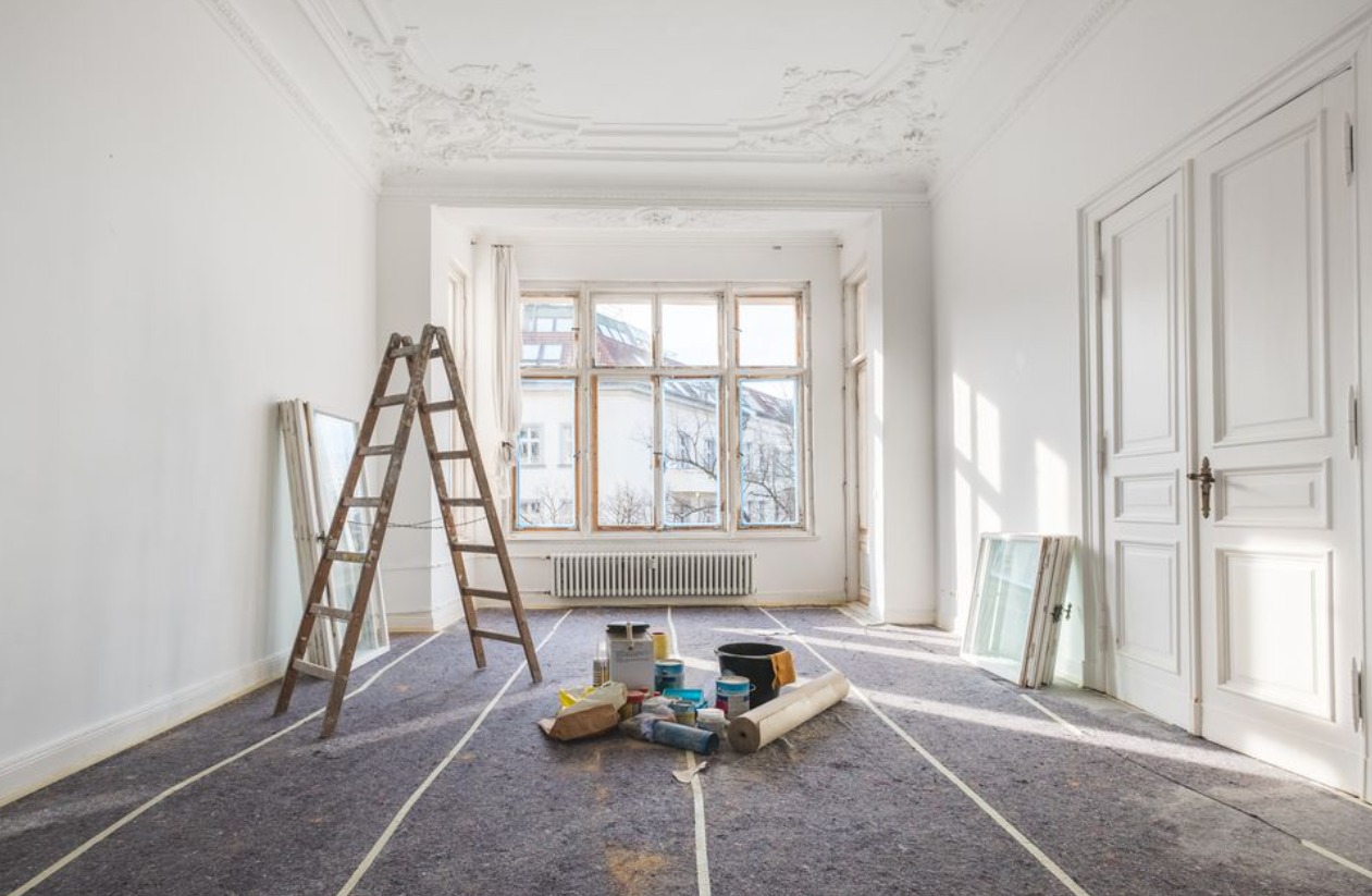
Base paint
It is generally recommended to apply a primer first. Depending on its main function, the product is available in different versions: a deep primer seals and strengthens absorbent or porous surfaces, a barrier primer prevents old wallpaper patterns or stains from showing through, and an adhesive primer ensures that the paint does not peel off very smoothly in the future. Surface. Marketers also differ in their ability to compensate for unevenness or cracks. Special products for wood or metal are also available.
Emulsion paint
Emulsion paint with a matt surface is the first choice for walls and ceilings when an even colour without surface shine is desired. They are easy to apply with a paint roller or tassel. If you’re looking for a very light shine, try semi-gloss.
Eggshell and latex paint
Eggshells have become increasingly popular recently, especially in the United States and the United Kingdom. What is meant here is not the light beige colour that is sometimes called “eggshell” but rather a slightly shiny colour that is also very resistant, so it is often used in the kitchen and on wooden surfaces. Latex paint, available in various gloss levels, is also less sensitive than emulsion paint.
Shiny color
Glossy colours reflect incoming light and have a tough, washable surface. They are used both indoors and outdoors, and wooden and metal surfaces, in particular, benefit from added shine. Similar to matt colours, there are also gradations here: silky, glossy colours. The colour is not as shiny as a glossy colour, but it is much more striking than an eggshell colour.
Ceiling color
Painting the ceiling is never fun. But standing under a freshly dipped paint roller can be even more pleasant with special ceiling paint: thanks to its thick gel-like consistency, it hardly drips, and the surrounding area remains quite clean. With its higher density, it can also better fill fine cracks.
Custom color
Kitchens can be oily and damp, and bathrooms must also be moisture-resistant. Colors adapted to these extreme conditions have proven helpful. Wall paint for kitchens and bathrooms is durable and easy to clean, resistant to water vapour, anti-oil and prevents mould – so the walls don’t look old quickly.
Floor colour
As the name suggests, floor paint is designed to be walked on. Regarding gloss level, it is usually in the mid-range: wear-resistant and tread-resistant. Floor paint is generally suitable for wooden and concrete floors.
Colors with special textures
The choice of colour also depends on the condition of the surface created with the paint. Now, several colours promise exceptional final results. These include textures reminiscent of suede, velvet, or metal and smooth, shiny, satin colours.
Traditional paint
Some manufacturers specialize in traditional products such as chalk or tempera paint. Such paints are generally ecologically compatible and produce a very dull surface. Chalk paint is water-based and highly absorbent; when strengthened with linseed oil, for example, Tempera-based paint has similar properties but is also stain resistant.

Multifunctional colour
Colour can also expand the function of the wall. This home office corner is painted with magnetic paint, which opens up new possibilities for attaching small objects or notes.
With chalkboard paint, the entire wall is transformed into a surface for notes or drawings: its dark, slate-like surface is easily written on with chalk, which can be erased at any time.
Comfortable color
Many manufacturers offer paint with special properties to make painting more enjoyable. One-coat paint promises high coverage, so no second coat is needed; express paint dries very quickly, and non-drip paint is so thick that even beginners can easily paint it. It all serves its purpose, even if the purists (and your dad?) insist that nothing beats classic wall paint applied in several coats and allowed to dry well in between!
How to Select the Appropriate Wall Paint Color for a Room
Choosing the right wall paint color for a room is crucial in enhancing the ambiance of your home. It’s important to have adequate information on how to go about this as having too many color options can make the selection process overwhelming. It’s essential to be cautious because selecting the wrong color can make the room look small and untidy.
To ensure you make the right choice, here are some guidelines for selecting the perfect wall paint color for a room that have been gathered from various sources.
- Set the tone
According to Mydomaine, the first step in choosing the right color for a room is to consider the ambiance you want to create. If you desire a peaceful and serene atmosphere, opt for soft, muted colors. Conversely, if you want a vibrant and lively ambiance, bold and brighter colors would be more suitable.
- Coordinate with the furnishings
When designing a space, it’s important to consider not only the wall paint but also the overall furniture scheme. Try to match the furniture concept with the wall paint color to achieve a harmonious look. Having contrasting colors for the walls and furniture can create a jarring effect.
- Consider lighting conditions
As per Architecturaldigest, the room’s size and lighting must be taken into account when choosing a wall color. Lighting significantly impacts how colors appear in a room. If a room has a bright color but insufficient lighting, it may not look its best. It’s important to carefully plan the lighting to simplify the process of choosing a wall paint color.
- Avoid overly intense colors
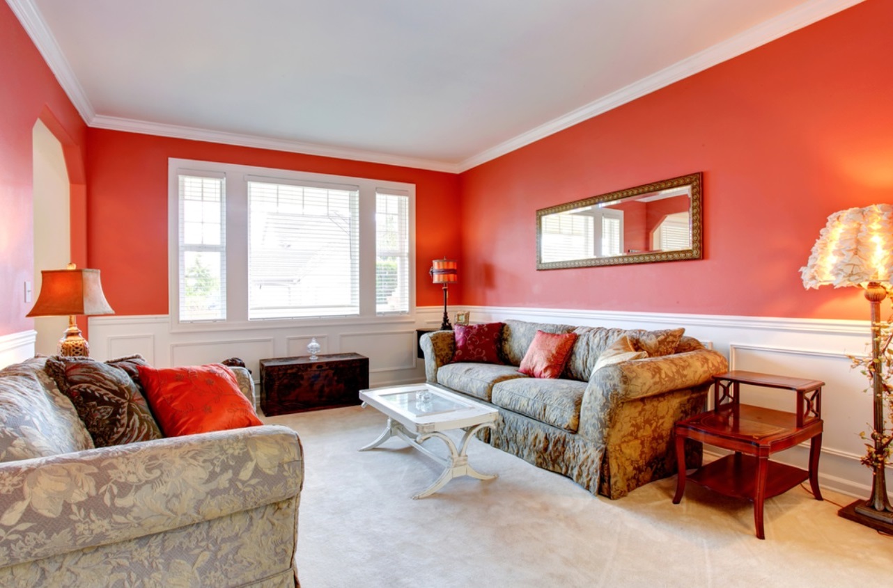
One approach to steer clear of when choosing a wall paint color for a room is opting for overly intense colors. Saturated colors such as yellow, pink, green, and orange should be avoided as they have high levels of brightness, making them less suitable for indoor use.
- Opt for aesthetic colors
According to Homestole, aesthetic colors can serve as a guide for selecting wall paint colors. Aesthetic colors not only create a clean and tidy impression but also give the illusion of a more spacious room. The aesthetic concept is widely popular today as it lends a luxurious and modern impression to a home’s overall appearance.
- Experiment with color combinations
Instead of using a single color, combining two to three colors in a room can be a great option. However, it’s important to carefully consider which colors to combine. Consulting an architect or home designer is advisable to ensure that the results meet your expectations.
- Embrace experimentation
Lastly, don’t be afraid to experiment to find the most suitable color for your home. Avoid the regret of choosing the wrong concept and color later on. Comfort is a key aspect of every home, so be mindful in selecting wall paint colors for the rooms in your home.
Selecting a “Cool” House Paint Color
Paint not only adds aesthetic value to a room but also creates a specific impression and desired atmosphere. To achieve a cooler impression, a cool house paint color is essential.
The term “cool” colors refers to colors that evoke a calm, peaceful impression. These colors are often associated with nature, like the sea, sky, or ice.
Common cool colors include blue, green, and purple. These colors can make a room feel more open and relaxed. Cool colors can also be used to create contrast with warm colors, such as red, yellow, or orange, to add a more dramatic and refreshing impression.
Factors to Take Into Account When Selecting a Cool House Paint Color
Picking the right house color is crucial in establishing the atmosphere and impression of the house. When choosing a cool color, there are several factors to take into consideration, such as the orientation of the house, the surrounding environment, and personal preferences.
- House Orientation
The orientation of the house is a significant factor to consider when selecting a cool house color because it can impact the amount of light that enters the house. A north-facing house will receive less sunlight compared to a south-facing house.
Bright and light color choices are more suitable for houses facing north to enhance the incoming light. Conversely, houses facing south will receive more sunlight, so darker and lighter colors are more suitable to reduce the incoming light.
Considering the orientation of the house can assist in selecting the right color to establish a comfortable and cool atmosphere in the house.
- Surrounding Environment
The surrounding environment is a factor that must be taken into account when choosing a cool house color as the chosen color must harmonize with the surrounding environment.
For instance, green can be an appropriate color for a house located in the midst of a park or in a green area as it can create a natural and cool atmosphere. Additionally, the chosen colors must complement the color of neighboring houses, as incongruous house colors can appear contrasting and unaesthetic. This will also make your home more memorable to neighbors and the surrounding environment.
Harmonizing colors with the surrounding environment will make the house appear cooler, blend in with the environment, and enhance the overall aesthetic appearance of the house.
- Personal Preferences and Lifestyle
Personal preferences and lifestyle are factors that need to be taken into account when selecting cool house colors as the colors chosen must align with your lifestyle and personal taste.
The chosen colors must be able to create a comfortable atmosphere in accordance with the homeowner’s desires. An active lifestyle will necessitate different colors compared to a relaxed lifestyle. Moreover, the chosen colors must align with the homeowner’s character, such as whether one prefers bold colors or favors soft colors.
By considering personal preferences and lifestyle, homeowners will feel more comfortable and at home in the house they inhabit. But the question remains, which colors can create this impression?
Cool House Paint Color Choices
Selecting cool house paint colors is crucial to establish a serene and tranquil atmosphere in the house. Colors such as blue, green, yellow, and white can impart a cool and calming effect to the house’s atmosphere.
This is perfect if you desire to create a comfortable and relaxing atmosphere at home. However, other factors such as the orientation of the house, the surrounding environment, and personal preferences need to be considered to find the right color choice.
- Blue
The color blue has long been associated with the color of the sky and the color of water. When applied to a house, this color also seems to possess magical powers. Being reminiscent of the sky and water, a room that incorporates the color blue appears to transform into a cooler space. So, if you are seeking a cool house paint color, blue can certainly be considered as one of the options.
Blue is also relatively easy to blend with other colors. It can even be combined with other minimalist house paint colors, such as pastel yellow, turquoise, and red as an accent. The combination of salted egg blue and white can also be a suitable blend to create the impression of a modern minimalist house. Other recommended blue house paint colors that you can experiment with are Fresh Blue, Norse Blue, and Winsome Blue.
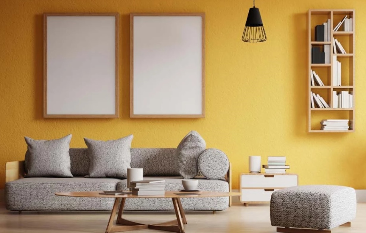
- Yellow
Perhaps many individuals do not favor this particular color. When used indoors, yellow can give the room a bright appearance. However, when applied appropriately, yellow can actually serve as a stylish choice for house paint. Yellow is one of the colors commonly found in nature. Additionally, this color is frequently utilized as part of minimalist house paint color palettes. To create a more natural and stylish impression, you can also pair it with brown furniture and green plants.
One method to incorporate yellow into your home is to select a soft, pale yellow shade. Pair this color with green. When illuminated, this color combination will make the room appear more expansive and well-lit.
Other yellow paint color options you may wish to consider are Absolute Yellow, Golden Yellow, and Zen Yellow.
- Green
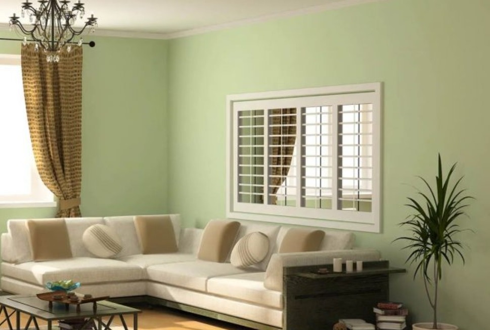
Green is often associated with the color of leaves, trees, and forests. The serene and rejuvenating aspects of nature are strongly linked with it. As a result, green is one of the most favored cool house paint colors. Green is also frequently utilized to infuse a natural ambiance into a room.
The imagery of a forest ambience with a gentle breeze appears to bring a sense of coolness to the room. Due to its relatively neutral character, it is not overly challenging to incorporate. If you opt to use green on the walls, it is advisable to select a light green shade or combine it with other more neutral colors. For instance, combine light green with white. Moreover, this color is often chosen as part of minimalist house paint color schemes.
Other recommended green paint colors to consider are Kiwi Green, Exclusive Green, and Young Tea Leaves Green.
- White
It can be said that white is the most conventional and preferred color for a room. Minimalist house paint colors frequently utilize white as their primary color.
White itself is highly versatile. This color has the ability to effectively reflect light and brighten up a room. Additionally, white creates a sense of spaciousness in the room. Its simplicity and strong practical attributes are what make it widely embraced in minimalist concept homes. Its neutral character also makes it easy to combine with other colors. If you are seeking a cool house paint color, this is a viable option. You can also combine it with other cool colors, such as green, blue, or brown.
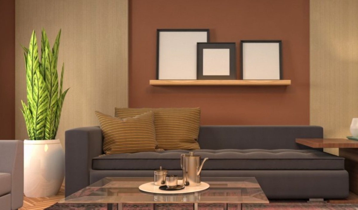
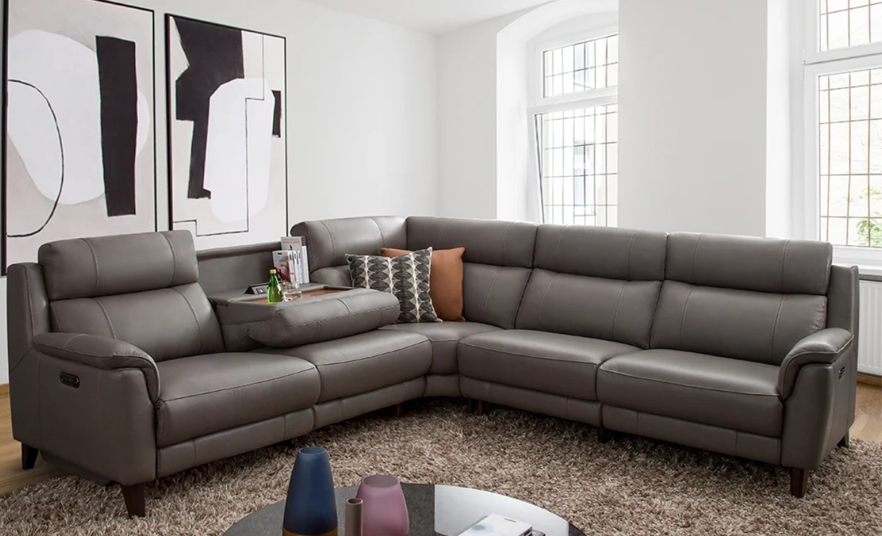
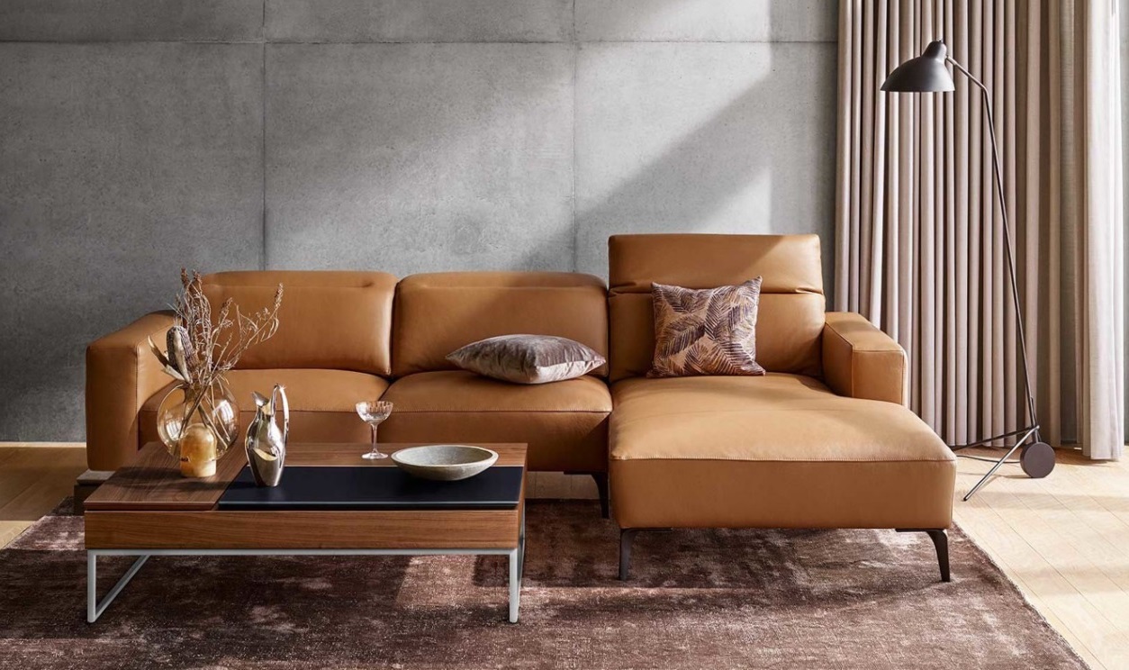
- Light Brown
Brown exudes a natural and earthy impression. Similar to green, brown is also closely associated with nature, wood, and trees. However, if you are aiming for a cool house paint color, opt for light brown. In addition to being more subdued, this color is also simpler to apply to a room.
Light brown also imparts a warm impression. When used in the bedroom or living room, the space feels more soothing, akin to a forest ambiance. Light brown can also be paired with other minimalist house paint colors. You can also combine it with green to infuse a natural feel.
Other recommended light brown wall paint colors to explore are Autumn Ashes, Artist’s Impression, and Arte Deco.
- Cream Color
Similar to white, cream is considered one of the popular colors. The character of this color resembles that of yellow. However, cream tends to be more subdued.
When used indoors, cream can evoke a calming and soothing impression. The cool ambiance of the trees seems to permeate the room. Cream also possesses a neutral character. Consequently, this color is easy to blend with minimalist house paint colors, such as white or light brown.
Other recommended cream paint colors to consider are Sunscreen Cream, Cotton Bud, and Bare Blush.